

Selling Eases, Market Bases
Selling Eases, Market Bases
We quantify the selling pressure and intensity.

Overview
The CPI rose by 9.1% in June, ahead of expectations. The PPI also came in with double-digit gains (+11.3%), suggesting more inflation in the pipeline. (High energy costs were the culprit behind the elevated readings, but we know futures prices have come down recently.)
US retail sales increased 1% in June. So between the strong jobs report and retail spending, it is unlikely that we are already in a recession.
Nobel Economist Paul Krugman’s blog post “Why the Markets Shrugged Off Bad Inflation News” is worth reading. (Summary: inflation may have peaked.)
The entire 2022 market decline has been driven by the Fed’s reaction function (or lack thereof). As a result, traders have vacillated between fears of inflation and recession. We quantify the resultant selling pressure.
Key Question:
Is the selling pressure abating? The selling pressure must diminish before the market can bottom. We quantify the selling pressure and intensity using proprietary indicators. (Note we identified the potential low three weeks ago.)
Performance Review
We begin by looking at the S&P-500 futures chart (because it does not show some of the gaps that the $SPX cash chart does). Observe the “long” wicks in the candlestick chart below. A long lower wick occurs when the market sells off and rebounds to close near or above the mid-point of the day’s trading range. Long lower wicks identify in an area of technical support for the markets. Hence, traders have discovered a base of technical support on the ES futures in the 3690-3750 zone.
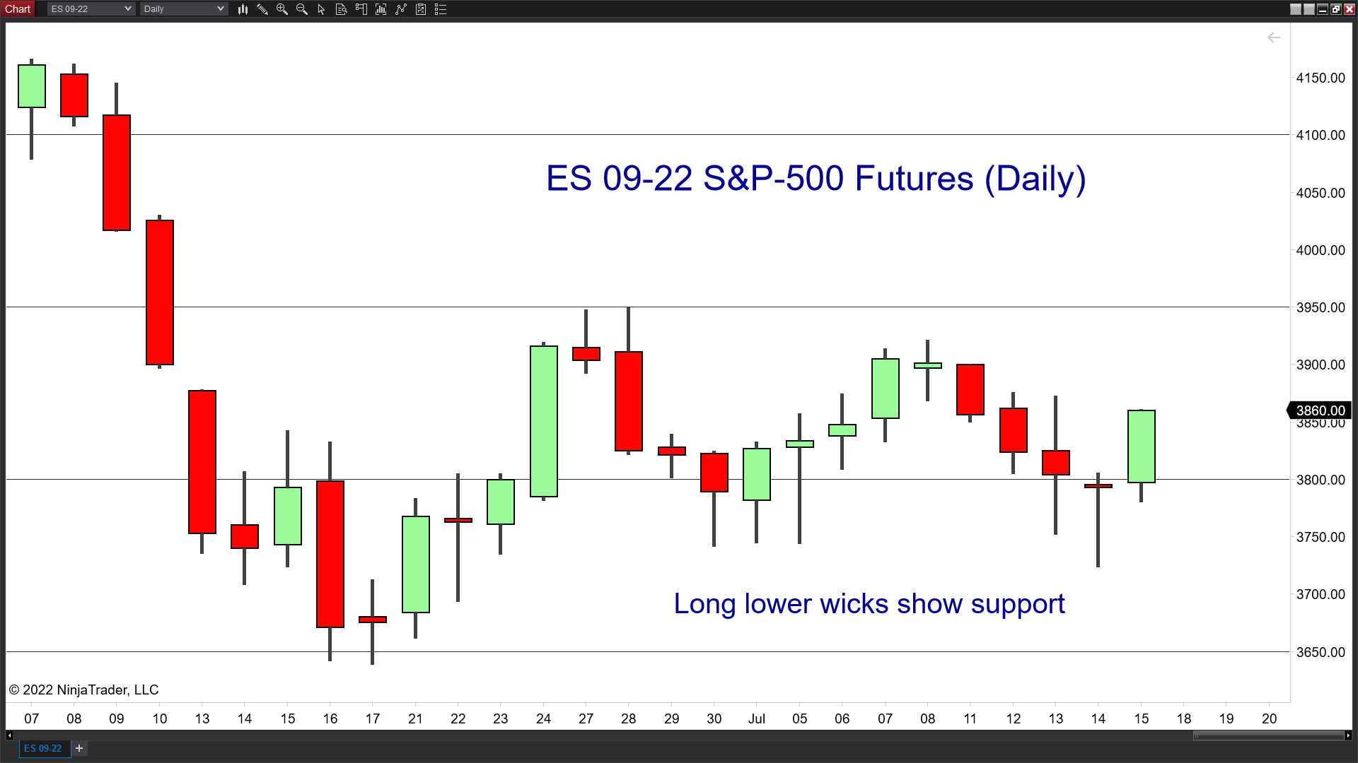
Below I update a chart I first used three weeks ago. Traders have a lot on their plate over the next few weeks, but they must ultimately close the gap (around 4000) during the recovery. The usual suspects, such as the 50-day moving average, are also overhead, resisting the rally.

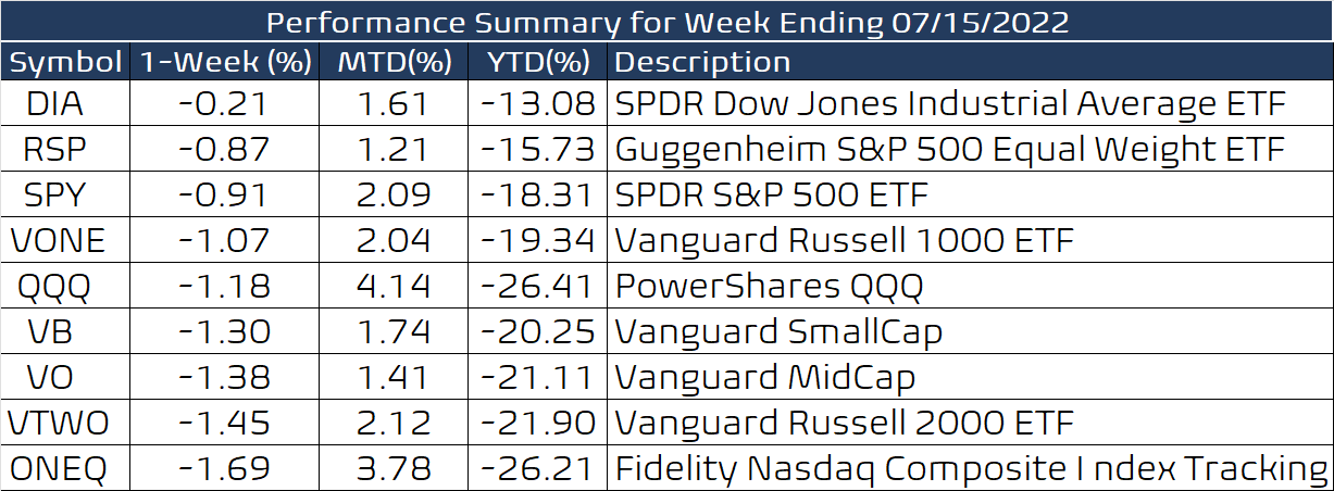
A losing week in the markets, but one in which it refused to buckle despite hot inflation numbers. So, the markets' resilience in the face of adverse data was encouraging.
The net bull/bear balance oscillated between positive and negative readings, but we ended below +60, so still not confirming an uptrend.

Quantifying Selling Pressure
The most recent historical episode of massive selling occurred in February-March 2020 at the onset of the Covid-19 crash. We look at a 20-day interval to calculate selling pressure, measured in S&P-500 points. A negative reading shows more selling, and a positive reading shows more buying. I used 20-day to approximate one month of activity.
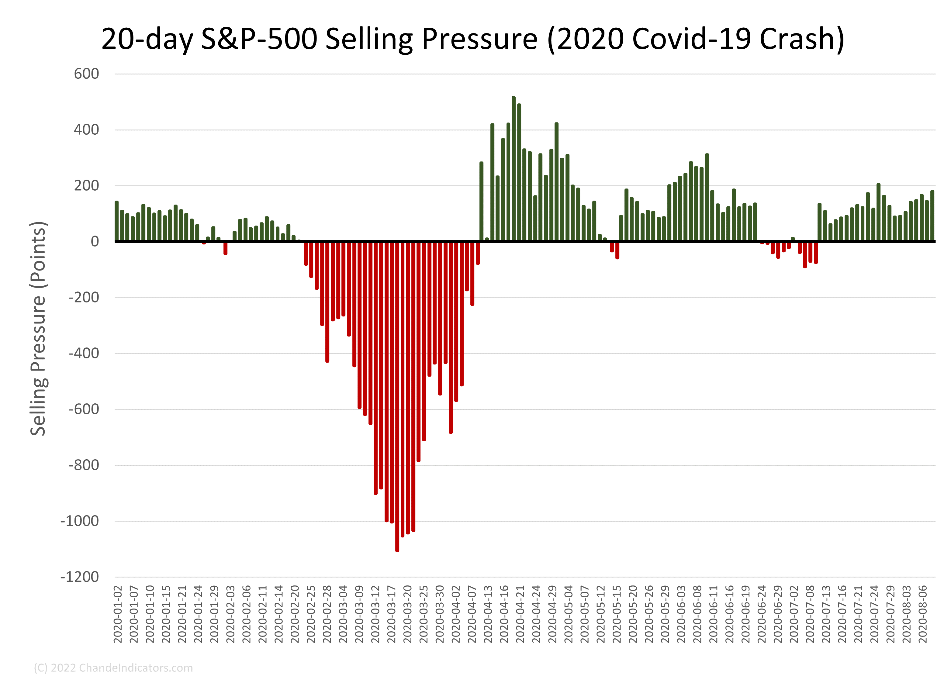
In 2020, the selling pressure was immense but concentrated over a few weeks. However, in 2022, the selling pressure has dragged on and on, though at only about 40%~60% of the 2020 level. Recently, the selling pressure has moderated a bit. However, we must plow through earnings, economic data, and the FOMC meeting at month-end before a clear picture of the next market phase emerges.
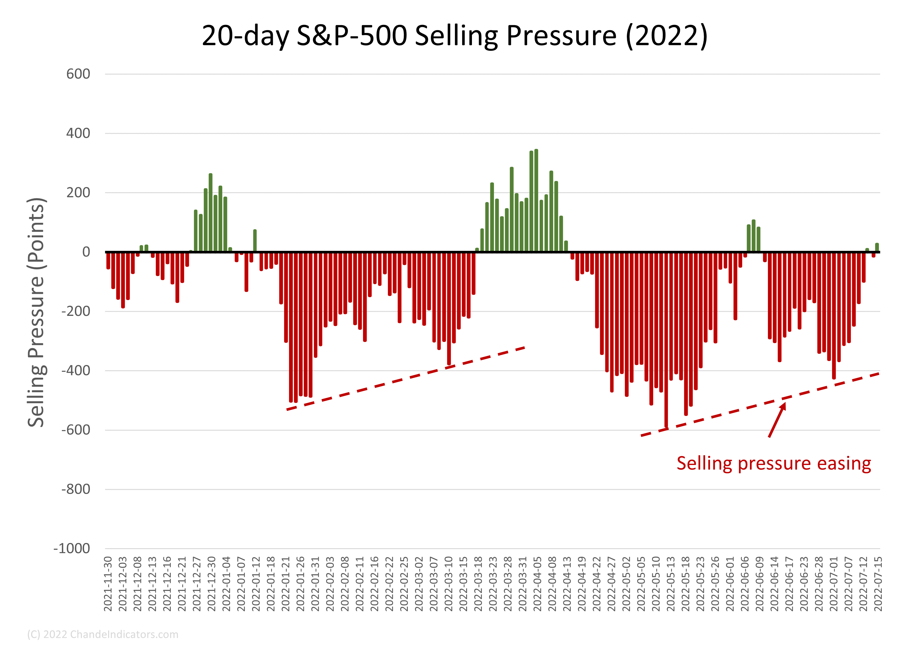
Yet another way to look at these data is to look at selling intensity on a scale of 0 to -100, where any positive selling pressure (green bars in the above chart) means zero selling intensity. Starting in early January, we have witnessed nearly continuous and intense selling. The selling intensity would have to diminish to zero for bulls to see relief, but none is visible just yet.

Bitcoin has become a reliable indicator of investor sentiment, i.e., of “risk-on/risk-off” behavior. Most recently, BTCUSD has been consolidating around a critical Fibonacci extension, and it also supports the view that the equity markets are basing.

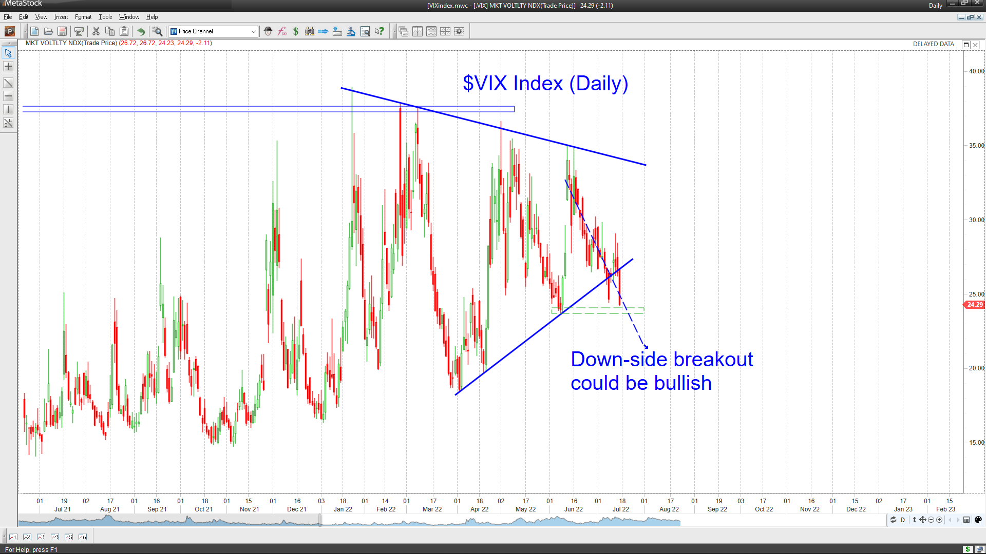
The VIX index market volatility. The VIX index rises when the S&P-500 drops quickly. We noted a decline below the lower boundary of a triangular consolidation on the $VIX chart would be bullish three weeks ago. Well, that has happened this week, but we will probably have to go past the FOMC meeting to see a sustained decline in this index.
I hope the FOMC will stick to a 75-bp increase in the Fed Funds rate in about two weeks. We will then have approximately two months till the next meeting in late September, which will allow the decline in energy prices to feed into the CPI and PCE readings and give the markets some respite from the waves of selling.
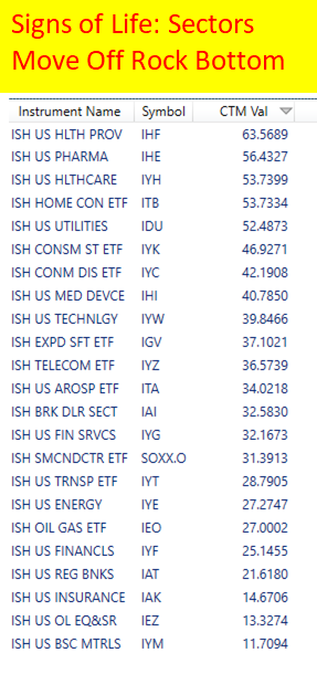
Meanwhile, the following table of sector trend strength shows where the trading opportunities lie. The scan uses MetaStock using the Chande Trend Meter (CTM) to measure trend strength.
Wrap-up
My posts should give you a good starting point, with context and suggestions if you like to research. Then, you can visit my website, chandeindicators.com, for more information and ideas. I hope you stay tuned and help by subscribing and recommending it to your friends and colleagues.
Thank you for spending some time with me.
Disclaimer
And now for some housekeeping. This publication is for “edutainment,” education, and entertainment, not for investment advice. Past performance is not necessarily indicative of future results. Our disclaimer at chandeindicators.com is included herein by reference.