


Feds Talk, Bonds Balk
Week Ending 19 March 2021

Overview
The Federal Reserve held a meeting this week, and indicated that rates would remain low, and that inflation was not a concern. On Friday, they effectively raised some reserve requirements for banks.
US 10-year Treasury interest rates rose to near 1.73 percent, and the yield-curve steepened.
The Dow-30 and S&P-500 indexes made new highs, then retreated a bit.
Technology and small-cap stocks were under pressure this week.
Key question
How high could interest rates go? (See chart below.)
Rising rates are approaching technical resistance.
Performance snapshot, key index-related ETFs.
If you like numbers, the table below gives a price-only return for key indexes and ETFs to give you a panoramic view of price action. Note that it was a losing week across the board, even though the DIA and SPY made highs this week.

Trend direction from leveraged ETFs
Trading has been choppy since late-February, and this sensitive indicator has bounced around a bit. Each crossover between the bull and bear lines is a change of trend. We had a good bounce since last Friday, only to reverse late in the week.
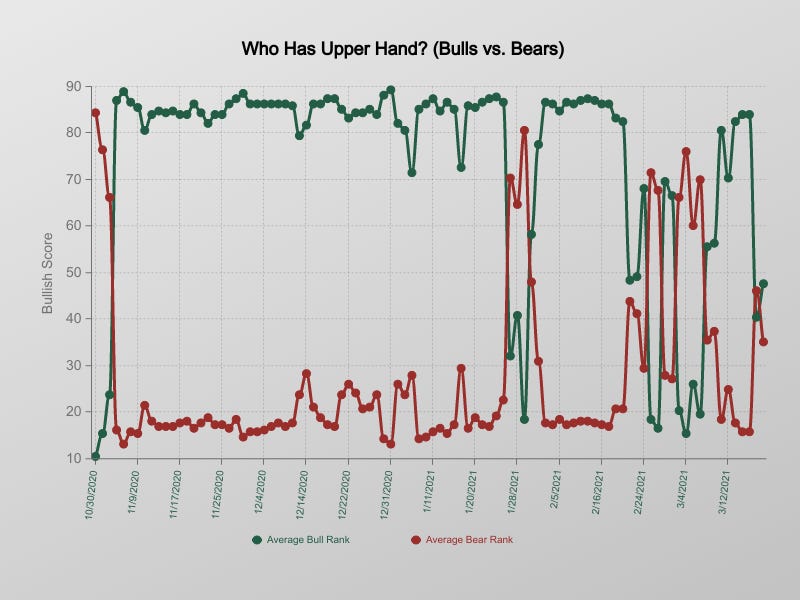
We look at eight bullish leveraged ETFs, and eight bearish or inverse ETFs, in a group of 34 total ETFs to gauge market direction. In either case, the lines rise when they are strong, and fall when they are weak. When markets are rising, the bullish ETFs rise. Conversely, when markets are falling, the bearish ETFs rise. In this group, the strongest performance gets a score of 100, the weakest performer gets a score of 0. So, when trends are strong, whether up or down, that group of ETFs gets high scores, and their average score will rise above 75. Conversely, when a group is weak, their average score will drop below 25.
Market-Cap trends: Growth vs. Value
Here we analyze Vanguard ETFs by market capitalization. We have picked growth, blend and value ETFs for small, medium, large, and mega market capitalization from the Vanguard stable. The horizontal axis is multi-period return, and the vertical axis is the sum of four technical trend strength indicators, each with a range from -100 to +100. The strongest ETFs are on the upper right, and the weakest ETFs are on the lower left. Small-cap and Mid-cap value ETFs are the best performers over the short-term, and large-cap and mega-cap ETFs have the worst performance.

Key to symbols: IVOG (MidCap 400 Growth ETF), IVOO (MidCap 400 ETF), IVOV (MidCap 400 Value ETF), MGC (MegaCap ETF), MGK (MegaCap Growth ETF), MGV (MegaCap Value ETF), VIOG (Small Cap Growth ETF), VIOO (Small Cap ETF), VIOV (Small Cap Value ETF), VOO (S&P 500 ETF), VOOG (S&P 500 Growth ETF), VOOV (S&P 500 Value ETF)
Strongest and weakest iShares ETFs
We analyzed the universe of iShares ETFs to find their ten strongest and the ten weakest ETFs. The Y-axis is a technical measure of “what the trend looks like” and the X-axis is composite return. Bond, momentum and clean energy ETFs were weak, and the surging Palladium prices drove PALL. For example, JKL, a small cap value ETF, is doing well, as we can expect from the Vanguard ETF data above.

Surprise Delivery
FedEx (FDX) reported strong earnings and bucked the sell-off on Friday for a nice 6 percent-ish pop. The chart shows a clear breakout. The long-term oscillators are still pointing lower, but the short-term oscillators are bullish: a rebound may be in the cards.

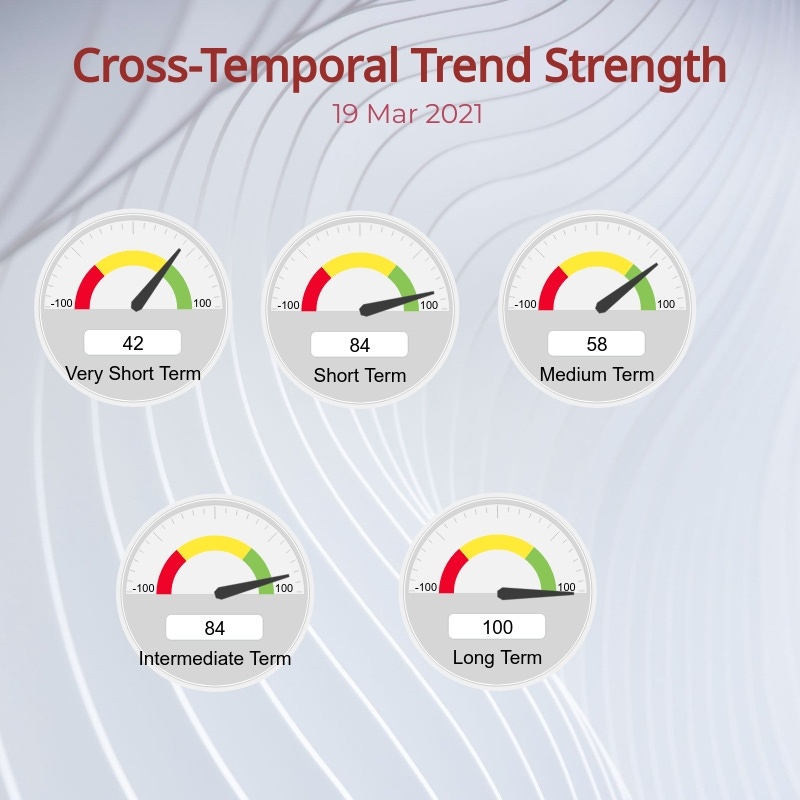
Market trend breakdown
The selling this week has mixed up the trend strength picture when we look at different time slices through the key market indexes. The long-term trend is still bullish. The weakness in the very short-term has started to drag down the strength in the short, medium and intermediate time frame. We view the current choppiness as a consolidation within a long-term uptrend, and thinking counter-trend, it could offer low-risk entry points into the longer-term trend.
What to make of this market?
The bulk of the down-side action has been in the NASDAQ index shown here. The chart is fairly “normal”… the market made a low, climbed above the bands, and is now re-testing the lower band. This is not unexpected. For the recovery to continue, we have to rise outside the bands again. The short-term oscillators below are neutral, consistent with a pullback into the bands. The S&P-500 and Dow-30 have just made new highs, and a small pullback is just part of the “regular” price action. We need the green line in Leveraged ETF trend check to rise above 80 for a sustainable trend to reassert itself.

US 10-year yields face resistance around 2%
US 10-year yields face strong technical resistance as they approach 2 percent. The 50 percent Fibonacci retracement plus prior support acting as resistance imply a significant barrier, at least in the near term. More broadly, the 1.85%-2.15% range should be a band of strong overhead resistance for US 10-year Treasury yields.

Chart Courtesy TradingView.com (https://www.tradingview.com/x/5koccgse/)
Wrap-up
This is the first of what I hope will be many weekly posts. If you like to do your own research, my posts should give you a good starting point, with context and suggestions. You can visit my website, chandeindicators.com, for more information and ideas. I hope you will stay tuned, and also help, by subscribing, and recommending it to your friends and colleagues.
Thank you for spending some time with me.
Disclaimer
And now for some housekeeping. This publication is for “edutainment”, education, information, and entertainment purposes only. It is not to be construed as investment advice. Past performance is not necessarily indicative of future results. Our disclaimer at chandeindicators.com is included herein by reference.