

A Lengthy Tutorial on our Stock and ETF Tables
A Lengthy Tutorial on our Stock and ETF Tables
Yes, they are that good.

Overview
This week’s post is a tutorial on our deep dive tables, for finding stocks or ETFs. I think the tables are a great source of investing and trading ideas, and I feel it is worth taking the time to work our way through the table once, at least.
Next week I will back to the usual format.
What does the table do?
Finding the strongest stocks or ETFs is the hardest problem for investors simply because there are many to choose from. We have solved that problem with our tables that summarize a wealth of information.
Imagine being able to simultaneously compare hundreds of stocks or ETFs, side-by-side, on an apples-to-apples basis. Imagine the convenience of not having to look through hundreds of charts and then remembering exactly which ones you liked and why. And now imagine the convenience of not having to look through all the charts every day, not even having to download any data. Imagine combining charts with several different time periods. Imagine applying your tools consistently and systematically to hundreds of symbols. Lastly, imagine clicking on a symbol and bringing up its chart and a capable charting solution. Yes, we can do all that. Such is the power of our Stock Finder and ETF Finder tables. The fruits of innovative technical analysis conveniently at your fingertips. We make it easier for you to focus on the even harder task of making the best investing and trading decisions.
What are the advantages of analyzing stocks or ETFs this way?
Any analysis of the performance or trend strength implicitly uses a look-back period for that analysis, and different types of traders and investors use different look-back intervals.
The first major strength of the table is that it combines many different time intervals, ranging from less than two weeks to a few months to a year.
The second key advantage is that it uses new and innovative indicators, which may be thought of as combinations of indicators. We are not relying on just one way to measure momentum.
The third benefit of using the table is that the oscillators are normalized on a scale of +100 to -100, so you can instantly assess both the trend's strength and direction. This also means we can combine the oscillators to gain even more insights.
The fourth important design feature is that the table uses a pair of short-term and another pair of long-term oscillators with different designs to cross-check one another to diversify our decision processes.
In short, there are different formulas for computing performance and trend strength over many different look-back periods, so that the combined table gives us quite an accurate and unbiased picture of market action.
So, whether you are a short-term trader, an intermediate-term trader, or a long-term investor, the table has something useful for you.
How often is the table updated?
The table is set up as an end-of-day table. This means it is not updated intraday. This, in a way, imposes its own discipline on the analysis.
Understanding the Layout of the Table
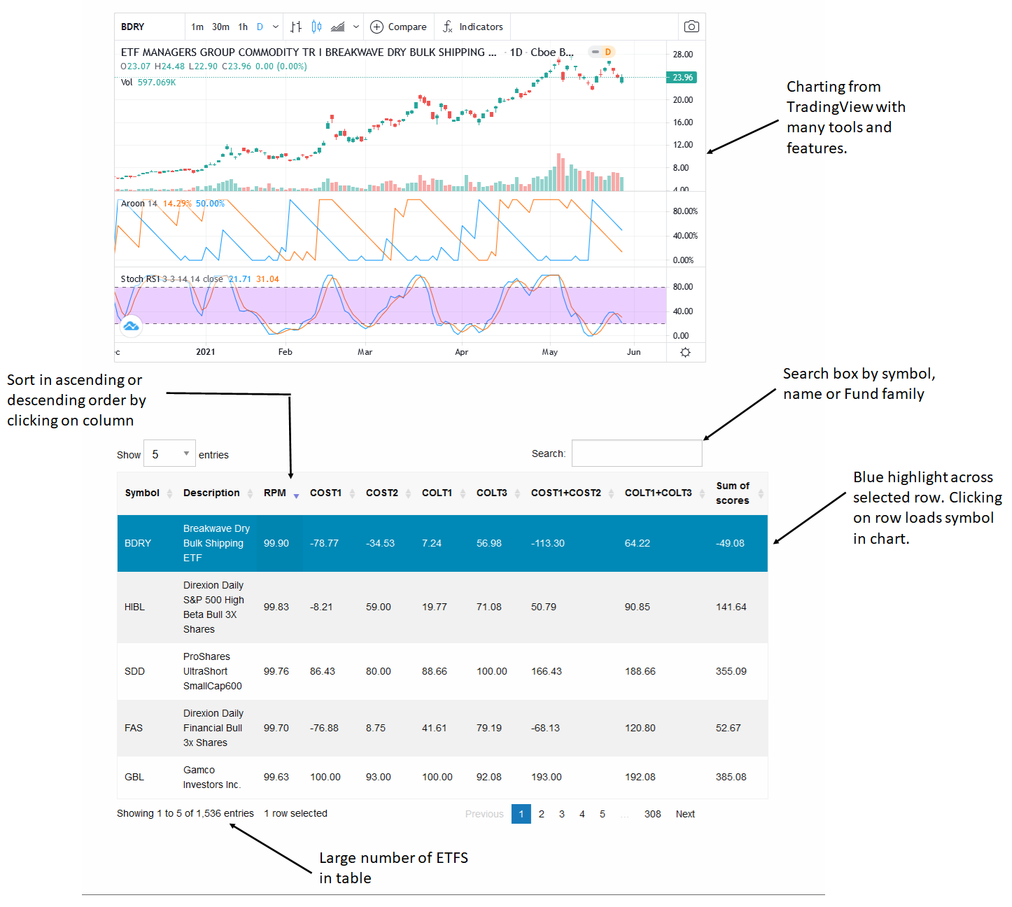
The table is laid out in two main panels. The upper panel is a charting widget from TradingView.com, which contains many technical indicators and tools. By default, we show two of my indicators, the Aroon indicator and the stochastic RSI (stochRSI).
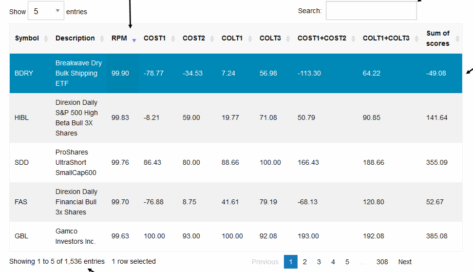
The lower panel has a searchable and sortable data table. There is a text-based search box in the upper right-hand corner of the table, just above the column headers. Another drop-down box on the left allows you to see either 5 or 10 rows at one time.
Below the last row, a footnote shows the total number of rows of data in the table.
You can type in the text box to search or sort by any column by clicking on its header. By default, the table is sorted in descending order by the RPM column.
Understanding the Data in the Table
The first two columns are symbol and description, for example, “GBL” and “Gamco Investors Inc.”
Column 3 shows the RPM or Relative Performance Meter on a scale of 99.99 to 0. We measure absolute return over different time periods extending out to one year and use a complex ranking procedure to develop an overall rank score. The stock with the best composite performance rank will be assigned an RPM score of 99.99. The worst performer will get a rank of zero. The RPM is designed for long-term investors to identify the strongest or weakest ETFs or stocks.
Columns 4 and 5 have short-term oscillators, measuring the direction and trend strength over a period shorter than two weeks. Their name is derived from Chande Oscillators Short Term (COST). They are computed in two ways to measure either change in momentum (COST1) or rank breakout patterns (COST2). Their scale is + 100 (Strong Up) to -100 (Strong Down).

Columns 5 and 6 have long-term oscillators, COLT1, COLT2. Their name derives from Chande Oscillators Long Term, hence COLT. They are computed in two ways to measure either change in momentum (COLT1) or weigh breakout patterns (COLT3). They measure technical parameters from a few weeks to a few months. The scale is + 100 (Strong Up) to -100 (Strong Down).
Column 8 has COST1+COST2: A simple sum of the two COST oscillators to rank short-term trend strength and direction for short-term traders or counter-trend entries. The scale is +200 (Strong Up) to -200 (Strong Down).
Column 9 has COLT1 + COLT3: A simple sum of the two COLT oscillators to rank long-term trend strength and direction for counter-trend entries or exits. The scale is +200 (Strong Up) to -200 (Strong Down).
Column 10 has Sum of scores: A simple sum of all COST and COLT oscillators for a composite measure of trend strength. We seek to identify those with strong swing moves within a longer-term upward or downward trend. The scale is +400 to -400.
How can I use the table?
The table combines relative performance (RPM) and absolute trend strength (all the oscillators). Taken together, the RPM gives an overview and direct apples-to-apples comparison of the relative price performance of one stock or ETF compared to all others in the basket.
The oscillators are chart-based and do not directly compare one chart to another but are an absolute measure of each stock or ETFs performance. They answer the question: “How does the chart look?”.
The table is mostly designed for trend-following strategies, but counter-trend entries and exits are certainly possible based on your perspective. When you sort any column in descending order, the strongest stocks or ETFs will always be at the top of the table and the weakest at the bottom.
This tabular format is very flexible and powerful, and you can use it in many ways. The simplest way to think about it is that the ETFs with the best momentum should be near the top when ranked in descending order. Trend-followers will focus on items at the top of the table; countertrend or “value” traders will focus on symbols at the bottom of the table.
These calculations are not available anywhere else. The table shows symbols without regard to volume, so some may have volume restrictions for large traders. Naturally, you bear all the risk of your trading decisions: the table is meant as a starting point for your own analysis.
What is the best approach for investors?
Investors should sort the table by the RPM column and focus their analysis on RPM > 80.
How can I analyze all ETFs from a single vendor?
Say you wanted to analyze all ETFs from iShares. You would type iShares in the search box, and as the last row shows, all 333 iShares ETFs would be isolated in the table out of 1536 entries. You can then sort the table as usual by clicking on the column headers to focus on just the iShares universe.

How can short-term traders use the table?
Short-term traders can sort by COST1, COST2, or COST1+COST2 to find stocks or ETFs with strong short-term momentum. This could occur as a countertrend move near the bottom of down-trends or during swing moves to new highs during breakouts. You can either look at the chart or at the COLT oscillators and RPM to understand the technical condition of the stock or ETF.

How can long-term traders use the tables?
Traders looking for strong-trending stocks or ETFs in the multi-month time trade can sort by COLT1, COLT2, or COLT1+COLT2.
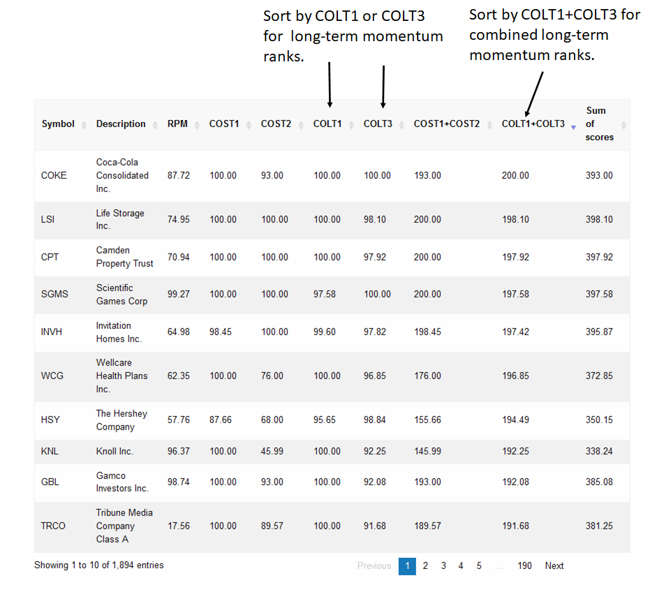
A Multi-Period Assessment of Trend Strength
You can get a composite view of trend strength by sorting by the 10th column, Sum of Scores. For example, see how the table helped identify COKE in the illustration below.

Summary
The Stock Finder and ETF Finder tables are powerful, flexible, and easy to use. The only way to be sure is for you to experiment with them yourself.
Next week I will be back with the usual format.
Wrap-up
If you like to do your own research, my posts should give you a good starting point, with context and suggestions. You can visit my website, chandeindicators.com, for more information and ideas. I hope you will stay tuned and help by subscribing and recommending it to your friends and colleagues.
Thank you for spending some time with me.
Disclaimer
And now for some housekeeping. This publication is for “edutainment,” education, information, and entertainment purposes only. It is not to be construed as investment advice. Past performance is not necessarily indicative of future results. Our disclaimer at chandeindicators.com is included herein by reference.